Layout Grid
다양한 해상도의 웹, 앱 환경에 대응하여 프로덕트를 제작할 시
전달하려는 정보의 완성도를 유지하기 위해
일관성 있는 Layout Grid 규칙이 필요하다.
머터리얼 디자인 그리드 시스템
Material Design
Build beautiful, usable products faster. Material Design is an adaptable system—backed by open-source code—that helps teams build high quality digital experiences.
material.io
Bootstrap 그리드 시스템
Grid system
Use our powerful mobile-first flexbox grid to build layouts of all shapes and sizes thanks to a twelve column system, five default responsive tiers, Sass variables and mixins, and dozens of predefined classes.
getbootstrap.com
Bootstrap 프레임웍 그리드 기반 Figma 샘플
Bootstrap Grid Templates for Figma - UI Kits for Figma
12 Columns: 1140px, 960px, 720px6 Columns: 540px
www.uikitsnow.com
1. Layout Grid 구성요소
- Margin : 콘텐츠 영역 밖의 좌우 여백
- Column : 해상도 세로 열
- Gutter : Colum 과 Column 사이의 여백
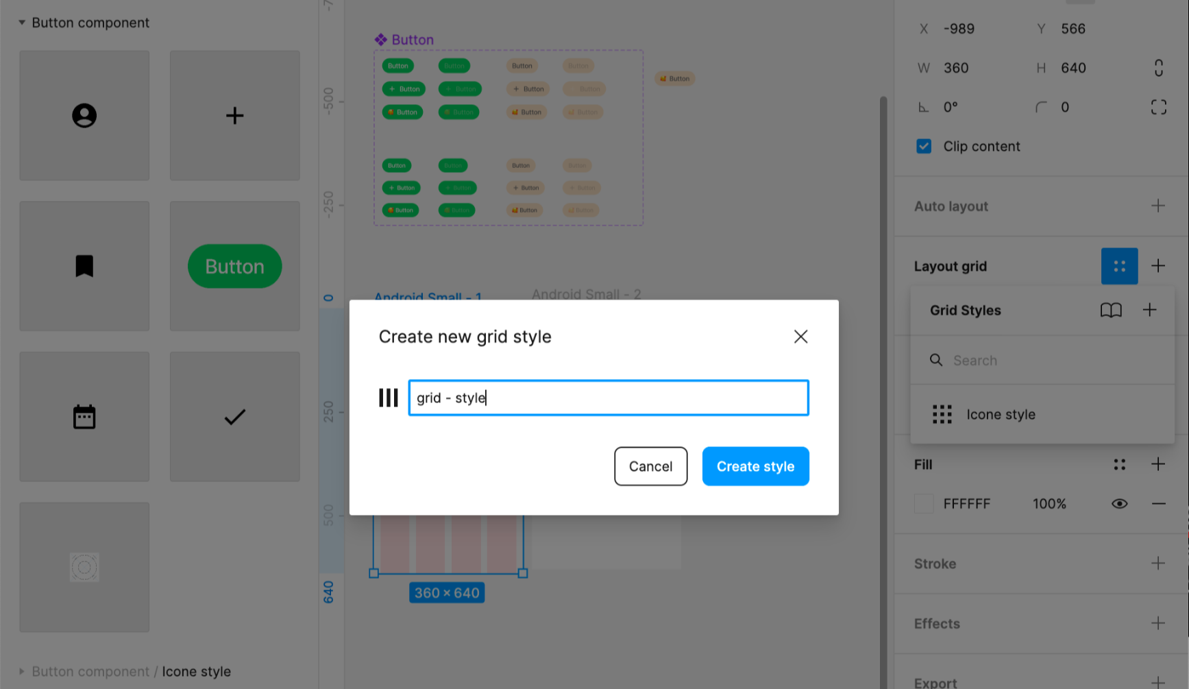
Layout grid에 style 에 저장 (ex: Grid / mobile-360)
'DESIGN > Figma' 카테고리의 다른 글
| [Figma #6] 디자인 시스템을 위한 스타일 정의, 피그마 버전 관리 (0) | 2022.09.18 |
|---|---|
| [Figma #5] 피그마 컴포넌트 & Variants 기능, 버튼 생성하기 Part 3 (0) | 2022.09.18 |
| [Figma #4] 오토레이아웃 기능 버튼 생성하기 Part 2 (0) | 2022.09.18 |
| [Figma #2] 스타일 버튼 생성하기 Part 1 (0) | 2022.09.17 |
| [Figma #1] 피그마 입문 피그마 다운로드, frame 해상도, UI Kit 활용 (0) | 2022.09.17 |


